JotForm has pretty much any type of Form Fields you might need. Take a look at the complete list below and get a brief description of each one of them.
BASIC FORM ELEMENTS
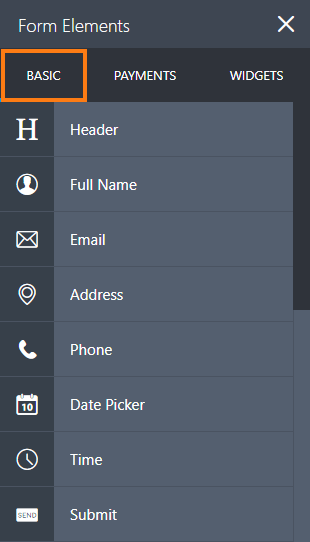
HEADER: A Header briefly explains what your form is about. Use the Subheader if you want to add more details.

FULL NAME: A predefined field with first and last name options. Use this as opposed to adding two Textboxes to make things easier.

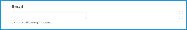
EMAIL: The Email field offers a built-in validation for the proper email format.
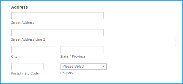
ADDRESS: Allows users to enter their complete address with predefined fields.
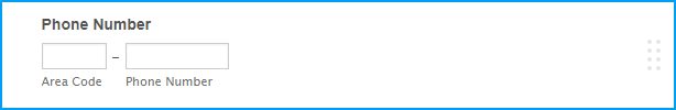
PHONE: Predefined phone number field to capture phone numbers.
DATE PICKER: A way to collect dates. This also offers an optional Time field.

TIME: Use this if you want users to fill out time in hours and minutes.

SUBMIT: This is always required. Without a Submit button, users won't be able to submit the form.

QUICK ELEMENTS
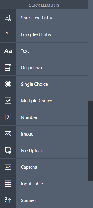
SHORT TEXT ENTRY: Commonly known as a textbox, your bread and butter as a general use field. Use this for collecting single line answers from your users.

LONG TEXT ENTRY: Commonly known as textarea that is used for comments, suggestions, additional ideas, or anything that requires long answers.

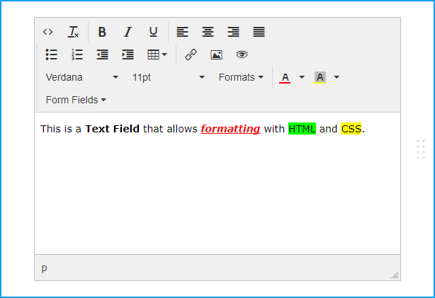
TEXT: A powerful tool that provides text information to your form. This allows HTML and inline CSS.
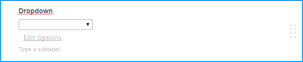
DROPDOWN: Dropdown menus are used with category related questions.
SINGLE CHOICE: Commonly known as a radio button, this is used for collecting single choice answers.

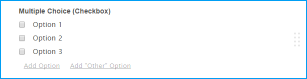
MULTIPLE CHOICE: Commonly known as a checkbox, this is used when you want to allow 2 or more options selected.
NUMBER: A number field to capture any kind of number.
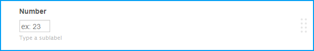
IMAGE: Allows you to add an image for your form. Easily brand your form with your own logo.

FILE UPLOAD: Allow your users to upload a file to your form.

CAPTCHA: Captcha lowers the likelihood of your form being spammed with multiple submissions. You can also enable ReCaptcha which is an advanced captcha service from Google.

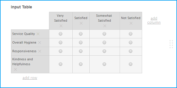
INPUT TABLE: Formerly known as the Matrix Field, this allows you to display input fields in a table format.
SPINNER: Makes it easier to input numbers.

SURVEY ELEMENTS
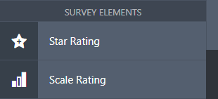
STAR RATING: Useful to get ratings, it can be in several shapes - Stars, light bulbs, etc.

SCALE RATING: Used for ratings based on a scale.

PAGE ELEMENTS
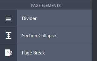
DIVIDER: Add a line that divides up sections of your form.

SECTION COLLAPSE: Formerly known as form collapse, this is used to show/hide additional sections of the form. Useful in splitting your form into expandable parts.

PAGE BREAK: Splits your form into multiple pages. Works best with a heading to indicate each page.

WIDGETS
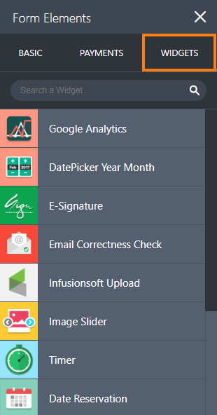
These are small plugins that you can add directly to your form. It provides advanced features and options that you won't find on regular Form Fields. To learn more about widgets, you can check our guide on Adding a Widget to your Form.